How we got here – and where we’re going
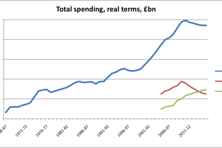
With the Spending Review less than two hours away, I thought CoffeeHousers might like to be armed with a few graphs that set the scene. What follows is by no means the complete picture of the fiscal landscape, but these are certainly some of most prominent landmarks. First up, real terms spending (aka Total Managed Expenditure) from 1966 to 2015: So, yes, all the fuss is about that small dip at the end of the blue line – a dip, as it happens, of about four percent. But don’t think that the fuss is entirely unwarranted. What the government is trying to do here is curb a trend of ever-increasing