Just ten days ago, Boris Johnson was attacking lockdowns for the “psychological, the emotional damage” they inflict: the effect on mental health as well as the economy. Then, he saw Covid-19 as a menace that could be managed with a “commonsensical approach” of local and regional measures. Now, he sees Covid as a monster capable of overwhelming the NHS and warns of a “medical and a moral disaster” if we do not do a stay-at-home lockdown. His view of the virus seems to have changed, utterly. Why?
As soon as he started his statement, he turned to the graphs on which his case hangs. It was not so much new data, but new models showing new forecasts. Sir Patrick Vallance, the Chief Scientific Officer, ran through them: the same ones leaked to the BBC a few hours earlier. As we know, the first wave peaked at just over 1,000 daily deaths. The new graphs show deaths hitting 4,000 deaths a day – perhaps even as high as 6,000. To put this in perspective, daily deaths in the USA peaked at about 2,500. If 4,000 is daily deaths is now plausible from a second wave in Britain, as the models seem to suggest, drastic action is understandable. Here is the graph, shown at the press conference, that makes the case for lockdown :-
The above graph is quite a departure from previous understanding of Covid’s potency. We now see second-wave deaths dwarfing not only those from the first wave but those envisaged by the government’s official ‘realistic worst-case scenario’ (RWC) for the coming winter. The RWC was a secret until The Spectator published it a few days ago, showing deaths peaking at about 800 a day. Here it is.
All the precautions we’re taking seem not to have protected us from a second wave far bigger than the first
When we printed the above chart, it looked bad enough. Now it looks tame by comparison of the new studies. And there’s no mention of ‘worst-case’ scenarios: these are billed only as ‘winter scenarios’. But who drew them up? What are the assumptions? And how robust are they? The leak this morning told us who did the modelling: Cambridge, Imperial, etc. Just as an Imperial study made the case for the first lockdown, these four studies make the case for the second. So they ought to be published, together with the assumptions behind them. It would help explain how we get from the data we’ve seen in recent weeks to the scenarios shown to us now, which suggest a tsunami.
The last time we had a gloomy scenario outlined to us in a No10 press conference was 21 Sep when Vallance & Whitty gave a projection of 50,000 reported daily infections by mid-October. Those who were sceptical of their ‘projection’ were soon vindicated: by mid-October, infections stood at barely a third of their figure (see graph) and even now it’s barely half. There were other signs of progress: cases in Manchester had been coming down even before it was put into TIer-3. Cases in Liverpool have been falling too. ONS serology studies suggest the growth rate of the virus (the ‘R’) has been falling softly throughout October. This is perhaps why the PM was confident about his strategy just a few days ago.
Yet now, we’re suddenly told that none of this was enough. Tier-3, the Rule of Six, the curfews, the masks, the distancing, seven months of furlough, the end of mass-audience events, a London where commuting is a third of its pre-crisis size: none of that is shown in the new graphs to have any affect on stopping the virus come back at up to four times the size.
So what’s the new information? Why have the forecasts become so much worse? Is it because the virus is deadlier than we had thought, or that the current Covid measures are less effective than we thought? How did we get to a position where the NHS would be flattened unless we close pubs, churches and bookshops etc? Are there similar studies in Europe, with massive upgrades pointing to a Covid second-wave tsunami on a similar scale? Or do we feel there’s something particular to Britain that means, even after the precautions we were taking, that the second wave really could rise four times as high as the first? Somewhere along the way, assumptions have changed – a lot. We have not yet been told which ones, or why.
Then the new hospital numbers. This time, we were shown not a range of scenarios but the government’s SPI-M forecast, showing far more hospitalisations than the first wave. The Sage worst-case scenario we published was dated 30 July – and it involved maxing out at just over 3,000 admissions per day. Now the new central estimate, below, easily smashes through 4,000 – it’s not even a peak – rising perhaps as high as 8,000.
What are the assumptions used to make the above chart? And how did they change so quickly? Look closely and you can see the blue shaded area seems to take, as its starting assumption, that hospital numbers could be twice as high as officially stated. Is this really the case? We don’t know, because the study behind the graph has not been published. {**UPDATE: It was later published, with an admission that it contained errors. See below.]
One of the biggest puzzles is why, if such a surge was always on the cards, did we not use this summer to scale up the NHS? Build new Covid treatment units, to stop the virus spreading in hospitals? We’re now back to ‘protect the NHS’ as a mantra: a phrase deeply controversial amongst the doctors and the NHS more broadly because it discourages the sick from seeking help. You’ll note the absence of any modelling on the extra cancer deaths, extra deaths from Alzheimer’s and the general cost of the new national lockdown on a country where almost half of the over-70s live alone.
When The Spectator published the leaked July 30 Sage RWC analysis earlier this week, we ran the whole document with every assumption in it. Some of them are quite important: for example, that the infection fatality ratio is 0.7 per cent. That’s pretty important because it’s a death rate more than twice as high as the current consensus (0.3 per cent). Sage seemed to be pushing the ‘worst case’ parameters to the max, yet its daily death projections are now dwarfed by the new ‘scenarios’. Again: why?
The new national lockdown is due to last for four weeks. But the new graphs point to a peak in December or January – so it’s far from clear that the restrictions will be relaxed in either of those months. Soon, MPs will be asked to vote on the new lockdown. Quite a few will wonder if No10 has properly asked questions of SAGE and whether No10’s decisions are being made on a robust premise. There will be a lot of people outside of parliament, too, interested to know more about how Covid went being manageable threat to an NHS-crushing monster in the space of a few days.
It’s understandable that Boris Johnson should change his mind when presented with startling new evidence. But if he now seeks to persuade others, it would help him – and everyone – if he published that evidence.
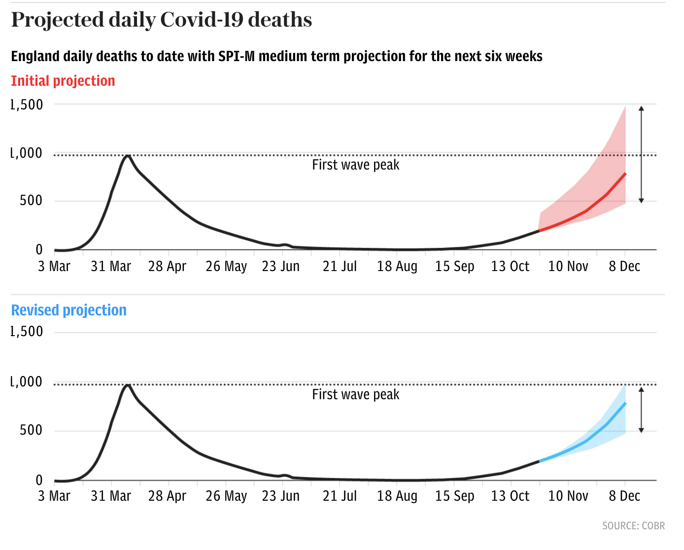
UPDATE: The Daily Telegraph has found documents admitting to errors in one of the graphs. Below, we have the incorrect graph shown to 15 million people on TV and, beneath it, the graph as it should have been. All of this raises grave questions about the quality of data being used in No10 and the procedures it has to check the information used to make lockdown decisions.


Comments