
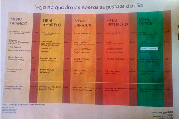
The appallingly bad photograph below was taken on my mobile phone about 15 years ago. It shows the menu layout from the Lisbon restaurant Chapito. I have never seen any other restaurant adopt such an ingenious format. You are given five set menus to choose from (white, yellow, orange, red and green) with a suggested wine for each. But you are perfectly free to substitute any dish from any other menu, or omit a course if you want. It is a brilliant example of what is sometimes called ‘choice architecture’.

This format makes it easier to choose what to eat. But it also helps you make a better choice. You have the same freedom as if you were to select from a conventional menu of five starters, main courses and puddings, but the format also contains an additional layer of information: it communicates what dishes (and wines) the chef believes complement each other best.
This is all to the good. Obviously we don’t want to be forced to eat something we hate; yet, in many cases, when otherwise indifferent, we would be happy to defer to the chef’s judgment. In a better world, all restaurant menus would be designed like this.
Seeing this, I have long wondered if there were other instances where we could dramatically improve decision-making by changing the presentation of information. For instance, would the property market be more effective if all estate agents were compelled to include some negative aspects to every property listing? A busy road, aircraft noise, a nuclear power station, being at the end of a long rutted track, not having a lift…?
This would save hours of time spent on wasted viewings. But it would also be more efficient, since people’s dislikes in housing vary much more widely than their likes. The best way to find a reasonably priced home is not to search for the perfect house — everyone will want that — but to find one which has qualities which most people dislike but which you don’t mind, or even perversely enjoy. When I first moved to London, my flat overlooked the main railway tracks out of Paddington and had a close-up view of the Westway. After 18 years growing up around the Wye Valley, this was bliss. Since I never go to bed before 2 a.m., I wasn’t bothered by the pub next door. And so on.
In all the debate over the expansion of Heathrow, it is often forgotten that there must be a million Londoners who enjoy watching aircraft overhead — and whose preferences are just as worthy of consideration as those of the neurotics and insomniacs whose voices dominate the debate. And Heathrow expansion is, when you think about it, a great way of providing low-cost housing for the deaf.
The planners of HS1 cleverly followed the route of the M2 and M20 motorways through Kent. Thus the trains pass by the homes of people who were used to noise to begin with. The same idea was put forward for HS2 — to follow the M40. For some reason this was ignored.
There is one group of people who do deserve real sympathy, but get none whatsoever, nor any compensation at all. Whatever you do, apparently, you should never buy a house next to a set of traffic lights. Most noises we can become inured to. Sudden noise — beeps, tyre squeals, air-brakes and crashes — stress you even when you are asleep.


Comments