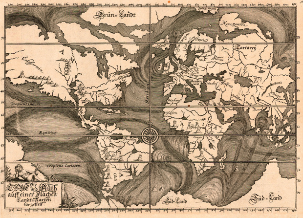
When you’re next waiting for a train at King’s Cross, don’t waste time window shopping on the concourse. Instead, pop round the corner to the British Library to see Beautiful Science: Picturing Data, Inspiring Insight (until 26 May). It’s not an enticing name for an exhibition, I grant you. But the show is beguiling: small, thoughtful and free.
As ever with the British Library, the viewer is treated to rare historic publications. Robert Fludd’s The Great Chain of Being (1617) is particularly memorable for its depictions of the ‘tree of life’, a diagram that encapsulates what this show is about: data representation as a means of storytelling, as artful and beautiful as the finest novels and poetry in the library’s collection.
Every table and chart in this exhibition reveals something profound about natural or human history — whether it is the evolution of a bird species or the incidence of cholera during the Crimean War (Florence Nightingale’s famous ‘rose diagram’ is on show). What is most striking about this history is not how much we know now, thanks to our ingenious gizmos, but how much our forebears learned from cruder observation. Compare Nasa’s representation of modern ocean currents with Eberhard Werner Happel’s conjectural map of 1685 (above). The method is different — satellite images versus the recollections of hoary sea dogs — but the result is similar. The Gulf Stream tears across the Atlantic, bringing plenty and peril in equal measure.


Comments