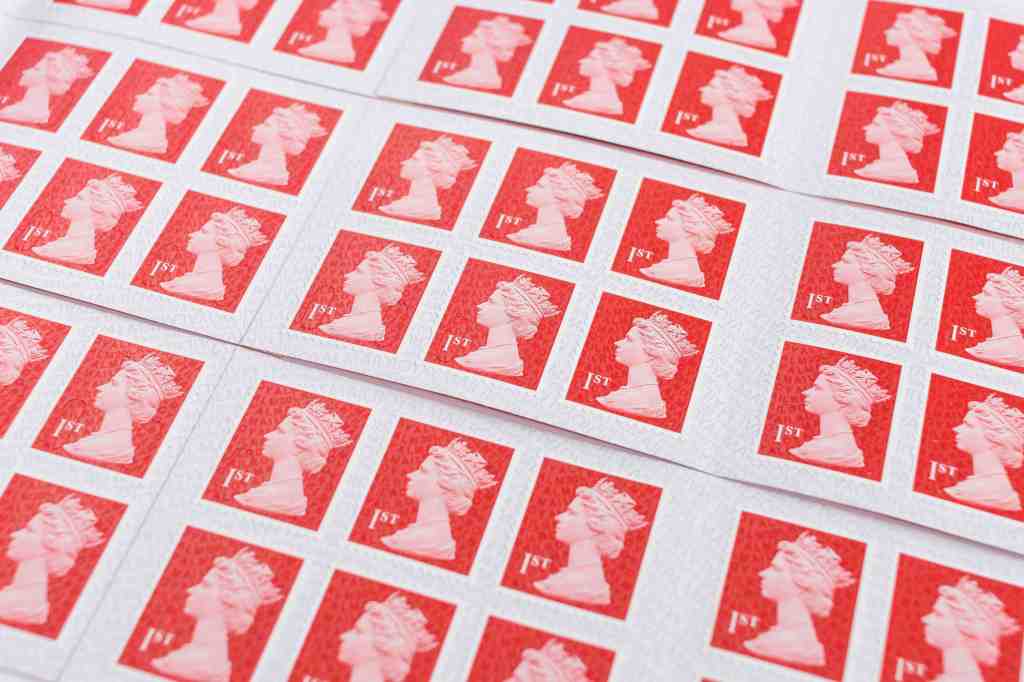
As King Charles’s stamps begin landing on our doormats more frequently, we’ll be saying goodbye to the familiar Arnold Machin silhouette of Queen Elizabeth II that has appeared on our envelopes for 55 years. But what is less familiar is the story of how that silhouette almost changed dramatically two decades ago.
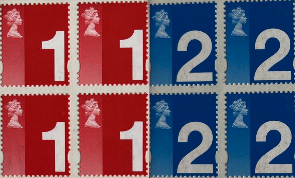
Early in this millennium, the Royal Mail’s design director, Barry Robinson, led a secret initiative to design a new set of ‘definitive’ stamps – the everyday 1st and 2nd class ones. The aim was to make it easier for visually impaired or partially sighted people to see the class of stamp by making the ‘1’ or ‘2’ much larger. The only way to do this? Shrinking the Queen’s head.
The design reduced the size of the Queen’s head significantly and also reversed the direction she was facing, having her looking to the right rather than the left
Robinson’s new design fundamentally changed the way the monarch had been depicted on stamps ever since the introduction of the Penny Black. It reduced the size of the Queen’s head significantly and also reversed the direction she was facing, having her looking to the right rather than the left.
Unsurprisingly, Robinson – who had already worked with the palace to design and produce the Charles and Diana stamps in 1981 and the Diana, Princess of Wales tribute stamps in 1998 – required Her Majesty’s approval for any new stamp designs featuring her silhouette. There was a misconception that the late Queen didn’t really see the stamp designs for approval, but this was not the case – she more than once made her views known, leading to amendments or a design being totally rejected.
So Robinson created and printed a limited quality of his new designs to share with the Queen. Despite the fact that they reduced the size of her head so significantly, her humility meant she was willing to approve them because she felt the new design would serve her people well.

Robinson returned to Royal Mail’s head office delighted at having succeeded in his pitch to the palace. However, he had a bigger obstacle ahead in breaking the news to Gillian Wilmot, an ardent royalist who had recently been appointed as the first female managing director for business and consumer markets at Royal Mail.
Wilmot (who was this year awarded a CBE in the King’s New Year’s Honours list) was horrified that Robinson was planning to ‘shrink the Queen’s head’ and adamant that it would ‘never happen’ on her watch. During a short meeting at her desk in full view of everyone in head office, Wilmot decided she had to protect the Queen and the reputation of Royal Mail – and blocked the introduction of the stamps. She took the two remaining books that Robinson had and threw them into her bin, ending their meeting rather abruptly.
Robinson returned to his team to tell them that the project was over. Royal Mail’s dedicated stamp printers were instructed to destroy all the sheets of the new stamps so that no trace remained – following protocol as stamps are like currency and have value once printed.

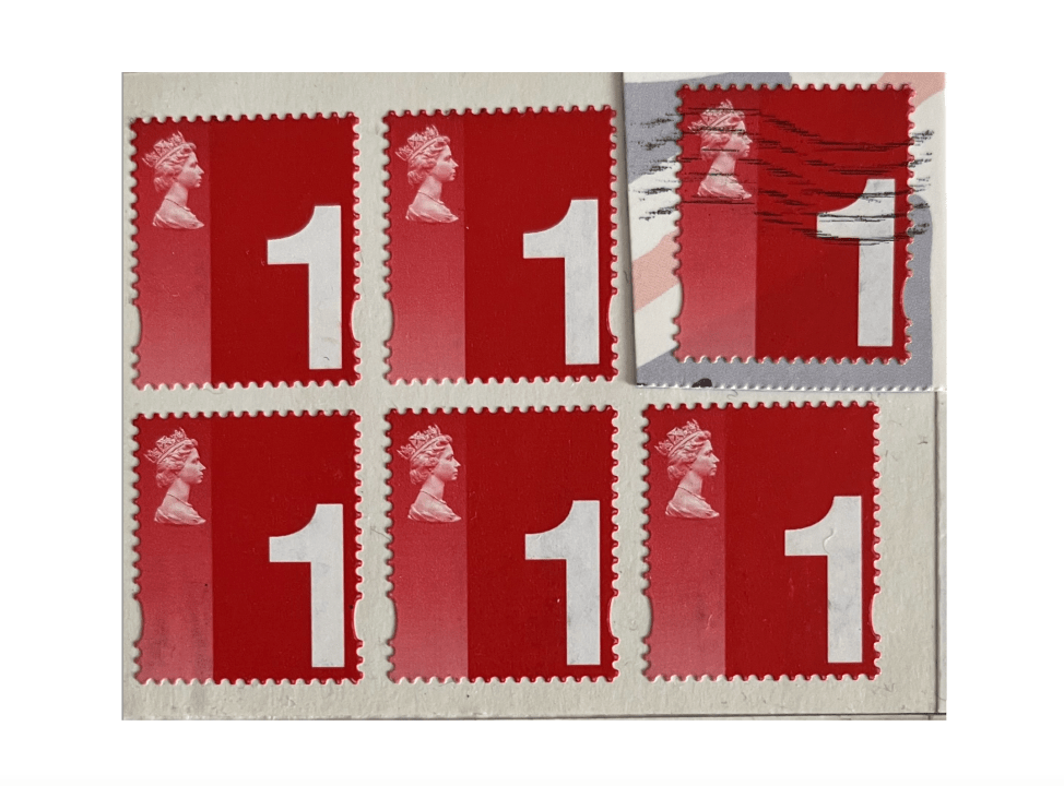
That would have been the end of the story had some of those stamps not been rescued from Wilmot’s bin before the office cleaners arrived that evening. One of each stamp has since been posted – showing that they are indeed real ‘definitive’ stamps. In total, only 16 stamps remain unused, making them very rare indeed. These stamps may be offered to collectors later this year (and it’s likely some have already found their way into the royals’ private stamp collection at the palace).
But most of all, the story shows the humility of our late, great Queen, who was prepared to reduce her own profile on stamps to benefit her subjects – never big-headed in the slightest.


Comments