I thought that CoffeeHousers might appreciate a few graphs to steer them around the prisons debate. It’s by no means a complete overview of the issue, but just three of the trends that hover over
Ken Clarke’s proposals:
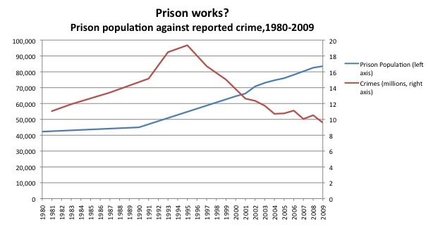
1. Rising prison population, falling crime

Well, that’s striking enough. Expect, as any fule know, correlation doesn’t necessarily imply causation – which is to say, the fall in crime could be due to something other than the rise in prisoners. Some put it down to improving economic conditions. Others mention deterrents such as CCTV. But those correlations can barely be hardened into a cause, either. So, all rather inconclusive.
The Prison Works argument is strengthened, almost to the point of decisiveness, by the similar graphs that Civitas have produced for other countries. In many cases, falling crime is associated with rising prison populations, and vice versa. One particularly eye-catching example is provided by Italy, where crime spiked after a mass pardon of criminals in 2006.
In any case, it is the graph above – or at least the sentiment behind it – that I suspect will most resonate with the public. It captures what is, for many, an intuitive point: bang up criminals, and crime goes down.
2. Reoffending rates
One of Ken Clarke’s central arguments is that prisons currently operate a “revolving door” policy. Inmates leave custody, only to reoffend, and soon find themselves back in the clink. The
following graph shows that, while it has decreased over the past few years, the reoffending rate is still worryingly high. 60 percent of former inmates go on to reoffend within two years of leaving
custody. Reoffending rates are lower among those who serve community services, although, in theory, their crimes were less severe in the first place.

3. Prisons spending
And Ken Clarke’s other argument is about the bottom line: we can’t keep on pouring money into prisons at a time when there isn’t much money to go around. This graph shows how prisons spending has risen over recent years:

Although it has actually fallen as a percentage of what the Home Office calls “public order and safety” spending, which also includes the police, etc:

The real question, though, is overall value. As Rod puts it in his post on all this: “the corollary might be that we haven’t got enough money NOT to lock people up, given the social and economic cost”. And so it all comes back to whether prison works or not. I shall leave CoffeeHousers to make their own minds up.


Comments