In 1935, Paul Nash observed that Edward McKnight Kauffer (1890–1954) was responsible for the change in attitude towards commercial art in this country. An American, Kauffer arrived in England in 1914 during a period of European study. He liked it and decided to stay, enabled to do so by his remarkable ability to design posters.
In 1915 Frank Pick commissioned him to produce the first of what became a remarkable stream of some 140 posters for London Transport. Hugely impressed by Vorticism, Kauffer became a friend and ally of Wyndham Lewis and introduced the Modernist sensibility into commercial art. Paul Nash commented, ‘It was the courage and aesthetic integrity shown in his early battles with the “plain business man” that made it possible for Kauffer to advance and eventually consolidate his position.’ Perhaps his outsider status as an American helped him to disregard established traditions and pursue a radical path; certainly he was responsible for some of the most powerful graphic design of the century.
Young Ted Kauffer of Great Falls, Montana, had established himself as a painter by the time he was 17, producing backdrops for a travelling theatre company, before going to work in a San Francisco bookshop. There he met Joseph E. McKnight, a professor at Utah University, who recognised his talent and paid for further studies in Paris. Kauffer adopted McKnight’s surname in grateful recognition, soaked up contemporary art in Chicago and Munich and was well on his way to becoming the innovative artist whom Wyndham Lewis christened ‘the poster king’.
In Gallery 1 of the Estorick’s enjoyable show, we see Kauffer’s early enthusiasm for Van Gogh and Fauvism in such poster images as the predominantly blue ‘In Watford’ and the brilliant red of ‘The Heaths, Surrey’. By 1919, he had adopted a more simplified, streamlined approach, though the colour is still vivid in ‘Hatfield by Motor Bus’.
The centrepiece in this gallery is the magnificent floor-to-ceiling ‘Soaring to Success! Daily Herald — the Early Bird’, a strikingly stylised and economic image of flight. Here, too, are an ink self-portrait of Kauffer looking slightly devilish and a small oil painting of Berkshire. In his design for Vigil Pure Silk, Kauffer moved even further towards dynamic abstraction, building the image around puissant zigzags and triangles. Four flat cabinets contain additional material including a lovely series of cotton bale labels. There are gouache studies and finished posters, including a collection advertising winter sales and the advisability of travelling by Underground in inclement weather.
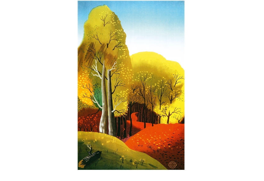
Gallery 2 opens with a great aggressive fist symbolising ‘Power: The Nerve Centre of London’s Underground’, though quite nearby is one of Kauffer’s most serene and pastoral images ‘Autumn Woods’ (1938). In the 1930s, his principal patron was Shell-Mex, as represented by its head of publicity, Jack Beddington. Here we have a group of those wittily minimal semi-abstract posters (Actors, Explorers, Musicians prefer Shell) for which Kauffer is so rightly celebrated. More display cabinets offer his designs for Christmas/New Year cards, which embody — like the posters — his watchwords of ‘veracity, brevity, vigour’, tempered with humour and romance.
In 1940, feeling increasingly ill at ease and unable to find work, Kauffer returned to America, but tragically regretted this move for the rest of his life. He continued to make distinguished designs, but his great period of vaulting creativity was over. The exhibition is accompanied by a slim, elegant catalogue (price £10.95) designed by Brian Webb, containing a useful essay by Alexandra Harris. McKnight Kauffer believed that commercial art could change the experience of life in the city for the better. The fact that many will recognise his images with pleasure, although they may not be familiar with his name, proves that good posters can enhance the quality of life and linger in the public consciousness.
Following my remarks the other week about museum curators preferring to mount exhibitions which display their own cleverness rather than the art the public wants to see, I’d like to remind readers of the great resource offered by our major auction houses. With the approach of the autumn sales of 20th-century British art, and the arrival of their catalogues, I am forcibly reminded (the catalogues having become increasingly weighty) of the excellent temporary exhibitions these sales afford. Where else in London at the moment can you see a collection of 14 high-quality Lowry paintings and a whole host of other modern masters? In King Street, St James’s, Christie’s is selling Lord Forte’s Lowrys, and in the same auction are fine things by William Nicholson and Stanley Spencer, Sutherland, Heron and Caulfield, Auerbach and Kossoff. There are also two tremendous Burra paintings: one of his late empty landscapes (‘Dartmoor’, 1974) and a really beautiful red and green garden picture. But perhaps more unexpected is a sumptuous oil called ‘Red Rocks, Brittany’ (1898–9) by Roderic O’Conor.
At Bonhams in New Bond Street there are a number of interesting things by Tristram Hillier and John Minton, a lovely early Paul Nash landscape from 1912, more Lowrys, intriguing-looking paintings by Prunella Clough and Peter Coker, a couple of Algernon Newton waterside pictures and a selection of Irish works including memorable pictures by Colin Middleton. At Sotheby’s a tranche of items from the Dartington Hall Trust is being auctioned, including a fine group of Cecil Collins pictures, a Gaudier-Brzeska alabaster and substantial paintings by Ben and Winifred Nicholson and Christopher Wood, together with ceramics by Shoji Hamada, Lucie Rie, Hans Coper and Bernard Leach. The supporting cast include Lowry once again, with a great painting of a reservoir, one of the best Bombergs I’ve seen outside a museum, good work by William Roberts, Burra, Adrian Heath and William Gear, and 13 rare drawings by Wyndham Lewis. These are works you simply won’t see anywhere else, and I recommend a visit. The catalogues are worth keeping as reference books — they often contain scholarly notes by experts as well as high-quality reproductions — but they can also be accessed online through the auctioneer’s website. Remember that viewing time is brief: perhaps only four or five days prior to the sale, all three of which fall on 15 and 16 November.
No room for a proper review — though it certainly merits it — but I must at least make mention of an exceptional exhibition at Waddington Custot Galleries in Cork Street (until 26 November) of paintings by Josef Albers (1888–1976). Albers is famed for his squares, and this is a show of rectangles, entitled Biconjugates, Kinetics, and Variants. But do not be put off by the terminology, for here is great sensuality and colouristic adventure. Even the grey paintings are dynamic (partly because of the painterly way Albers handles oil), and the pink, purple, orange and blue paintings sing with a richness that is rare in art of any period. Don’t miss this beautiful display.


Comments