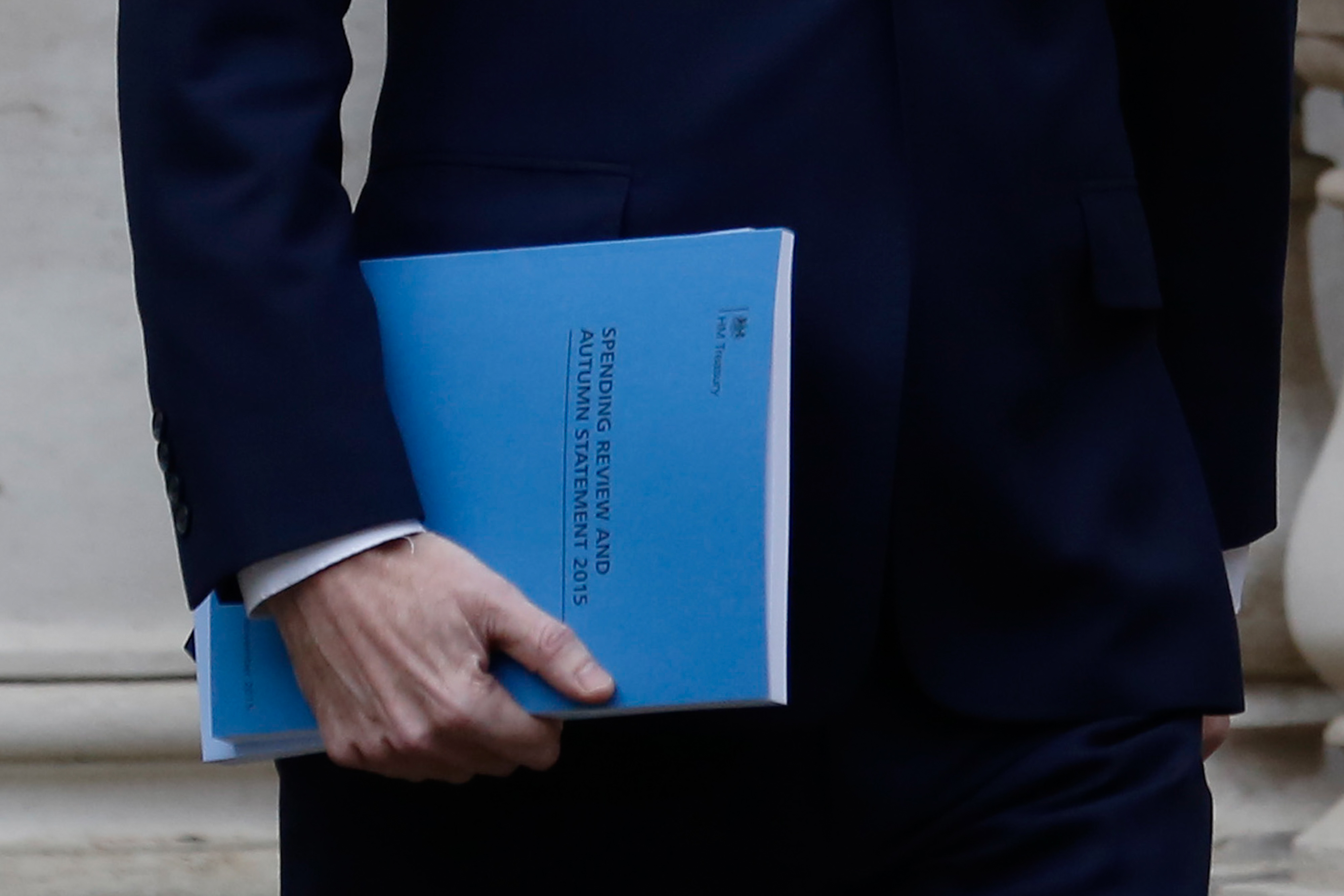
The Spending Review portion of George Osborne’s speech today has revealed some deep cuts to government departments. The chart above shows which ones will see the biggest increases in their spending over the next five years — DFID and Health — and the ones which will endure the brunt of the axe, namely Transport and Local Government.
How will this change the size of the departments? The interactive chart below shows where public money is currently spent by department — hover over a segment to see the current budget of that department:
This chart shows the funds that are projected for 2019/20. As you can see Health and Education, both protected departments, will still make up the vast majority of public spending:


Comments