‘Deaths could hit 6,000 a day,’ reported the newspapers on 17 December. A day later documents for the 99th meeting of Sage were released which said that, without restrictions over and above ‘Plan B’, deaths would range from 600 to 6,000 a day. A summary of Sage advice, prepared for the Cabinet, gave three models of what could happen next:
- Do nothing (ie, stick with ‘Plan B’) and face “a minimum peak” of 3,000 hospitalisations a day and 600 to 6,000 deaths a day
- Implement ‘Stage 2’ restrictions (household bubbles, etc) and cut daily deaths to a lower range: 500 to 3,000.
- Implement ‘Stage 1’ restrictions (stay-at-home mandates) and cut deaths even further: to a range of 200 to 2,000 a day
After a long and fractious cabinet debate, the decision was to do nothing and wait for more data. ‘Government ignores scientists’ advice,’ fumed the BMJ. But the decision not to act meant that the quality of Sage advice can now be tested, its ‘scenarios’ compared to actual.
Sage/Warwick hospitalisations
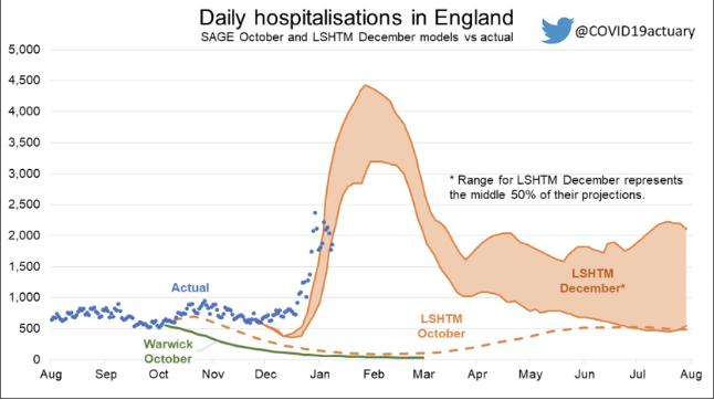
Let’s start with the Warwick model. It published various Covid scenarios depending on Omicron’s possible ‘severity’: 100 per cent as severe as Delta, 50 per cent, 20 per cent and 10 per cent. A UK Health Security Agency (UKHSA) document released on New Year’s Eve said: ‘the risk of presentation to emergency care or hospital admission with Omicron was approximately half of that for Delta’. That’s still its best estimate. So we open with the 50 per cent severity scenario. Here’s how Warwick’s model is performing for hospital admissions:
So: pretty far out. The Warwick scenario which closest matches actual hospitalisations in England is the one that assumes Omicron is 10 per cent as severe as Delta. But no one has ever claimed the new variant is as mild as that.
Hospital occupancy: the Sage/LSHTM model
The justification for restrictions is to prevent Covid from overwhelming the NHS, so hospital capacity is perhaps the single most important Covid figure. The 101st Sage meeting on 19 December included another statement from Sage’s modelling committee (SPI-M-O) highlighting the London School of Hygiene & Tropical Medicine’s (LSHTM) model for Covid beds. They presented 12 scenarios depending on:
- The degree of ‘immunity escape’ that Omicron might show
- Booster effectiveness
- The impact of further restrictions that government might impose
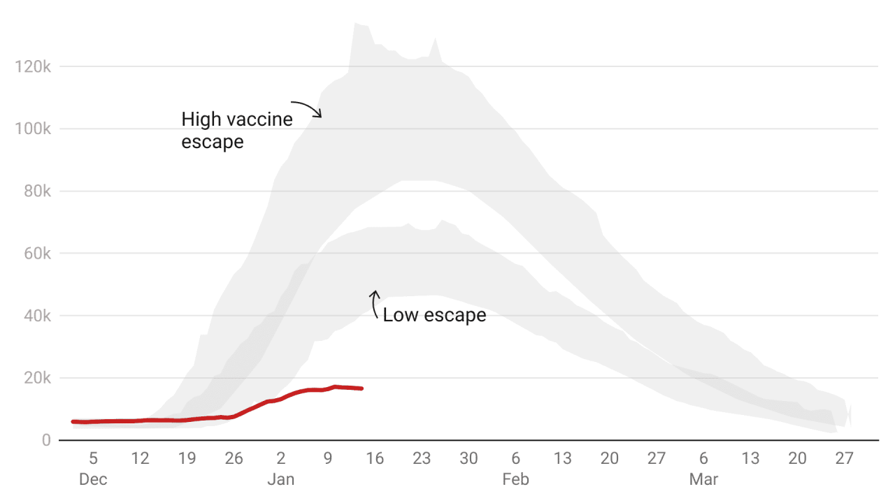
No further restrictions were implemented and boosters have proven to be 89 per cent effective at preventing hospitalisations – so the two remaining relevant LSHTM scenarios are the ‘high vaccine immune escape’ and ‘low vaccine immune escape’ scenarios (both assume high booster jab effectiveness). This is how the LSHTM model compares to actual:-
So: neither scenario comes close. This time, the shaded area represents a 50 per cent confidence interval rather than the more standard 95 per cent – the LSHTM gave themselves a much wider margin of error. But still, its most optimistic assumption proved far too pessimistic.
Finally, deaths. The headline-grabbing Sage range of 600 to 6,000 deaths a day was not directly sourced but seems to come from Warwick modelling released on 30 December. Its mildest scenario – with Omicron 10 per cent as potent as Delta – shows 600 deaths a day. And the just-as-potent (ie: 100 per cent) scenario points to 6,000 deaths.
The problem is that even the mildest Warwick scenario – the 10 per cent figure was intended to be so mild as to be ridiculous – is still quite far out.
Not all the models have proved so wrong. Some of the earlier Sage models on 16 December showed lower hospitalisations than actually occurred (though hospitalisations now look to be peaking well below the model) – but then they were revised upwards as pressure on the government intensified. Why?

So why were the Sage “scenarios” so wide of the mark?
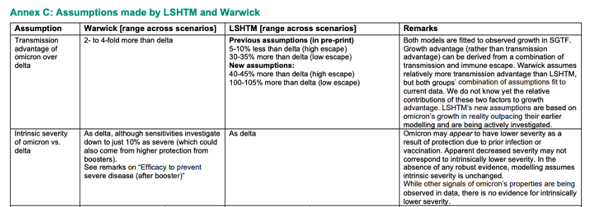
An annex in the Sage documents points to some of these revisions. It suggests that the LSHTM changed their models to show that Omicron was between three to eight times more transmissible than Delta – but did not appear to make any adjustments in the models for severity. They assumed the virus was as deadly as Delta but by then real-world South African data was clearly showing the variant had far less severe outcomes.

The Sage assumptions grid also said: ‘[the model] does not attempt to predict how individuals will change their behaviour in response to perceived risk.’ Might this be the biggest single flaw in Sage modelling? A year of global lockdown studies have shown that people very much change their behaviour, often well in advance of lockdown rules. We know this from Google mobility data and the experience of Sweden. Why these behavioural changes are ignored is a question still without answer. Sage presents this as a neutral decision (it does ‘not attempt to predict how individuals will change their behaviour’) but that is incorrect. The scenarios instead suggest to policymakers that people will not change their behaviour at all.
It’s not the first time Sage’s modelling has been overly pessimistic. Before the summer reopening Sage modelled bed occupancy and in no fewer than nine scenarios the actual figure was lower than modelled. We’re often told that models look wrong in retrospect because people adjust their behaviour – or because restrictions are implemented, thereby preventing predicted calamity. But when Sage gloom is ignored and reopening has gone ahead, its scenarios have proved to be wide of the mark.
Then again last September, when schools were reopening, Sage modelled hospital admissions. Too pessimistic again. Some have since claimed these scenarios were never intended to be forecasts or predictions, but let’s remember how they were described at the time: ‘The two scenarios of R = 1.1 and R = 1.5 attempt to provide an envelope which contains the likely epidemic trajectory over the next couple of months,’ (our emphasis). As so often, hospitalisations ended up below the lowest range of the lower Sage scenario.
The defences of Sage modelling (including those published in The Spectator) leave many questions unanswered. If the modelling is only ‘illustrative’ and does not predict or forecast, then why are they summarised (and presented to ministers) this way:
Without intervention beyond those measures already in place (“Plan B”), modelling indicates a peak of at least 3,000 hospital admissions per day in England.
And why are scenarios described as being ‘likely’?
Modelling matters. It has consequences. If the Sage summer reopening scenarios had been believed (as they were by Keir Starmer) lockdown could have been extended – with all the social and economic damage that would entail. If the Sage autumn scenarios had been believed, schools might have remained shut. If just one December cabinet meeting had gone differently there would have been sweeping restrictions that the real world data now tells us would have been completely unnecessary.
The Spectator’s data team has been using new techniques to follow Sage graphs: scanning software that lets us interpolate the hidden values (the figures are, oddly, not released) and an API Covid data feed that lets us compare Sage scenarios to the eventual reality. But it’s surely time for a proper public inquiry to look into how these Sage ‘scenarios’ were put together and presented to policymakers and the public.


Comments