Earlier today, Prof Neil Ferguson told a parliamentary committee that the UK death toll would have been halved if the UK had locked down a week earlier. A claim certain to generate headlines – but how confident can we be in his figures?
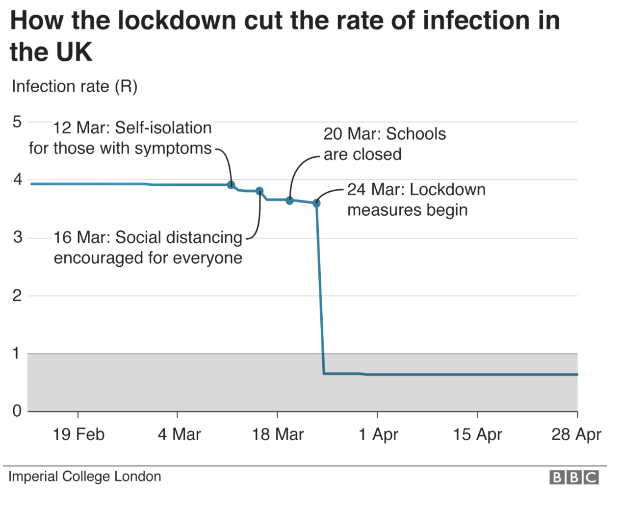
I’m a financial strategist, and like many people whose day-job is analysing complicated data I have been watching – open-mouthed – at how estimates have been dressed up as fact during this epidemic. Imperial College’s hypothesis is not difficult to explain. Before lockdown, Covid was growing with a reproduction number of about 4. So: every infected person gave it to four others, each of whom gave it to four others etc. If this were the case, you don’t need to be a maths genius to see that it would spread in a terrifying way. Crucially, Ferguson claimed that the various interventions – self-isolating, closing schools etc – would make hardly any difference to this monstrous R number of 4. But lockdown? Why, that would make the ‘R’ collapse. The below is the Imperial College graph, reproduced by the BBC.

But now we have data, we can work backwards – as other countries have done – and see what the actual R-number for Britain was. A study from Bristol University has already done this for infections, showing them peaking before lockdown. But Prof Ferguson is doubling down on his original line today, talking as if lockdown slammed an emergency break on the virus.: ‘The epidemic was doubling every three to four days before lockdown was introduce,” he told MPs. “So had we introduced lockdown measures a week earlier, we would have reduced the final toll by at least a half.’ Cue tomorrow’s headlines. But how many of them scrutinise the assumptions behind his claim?
The shape of the infection curve is strikingly similar for all three countries
The R number – the rate of infection – can be deduced by looking at deaths. It is simply a measure of the difference in the number of infections between each ‘generation’ of an infectious disease and the next. For Covid-19, an average (established early on by the WHO) of five days elapse between me becoming infectious and (having given it to you) you becoming infectious: this is the ‘serial interval’. So if four people have Covid and five days later 12 people have covid, the R is 3 (12 divided by 4).

Now let’s bring in the reproduction rate of Covid-19 for two other European countries; one lionised for its early response (Germany – green), and one that has eschewed lockdown altogether and has allowed group immunity to build without sacrificing civil liberty and education (Sweden – blue). Again, drawn from the actual hospital data and working back. You’d imagine the difference would be night and day, no?
The green line in the graph below shows the seven-day average of German R (to smooth out day-to-day variation) and is published daily by Germany’s Robert Koch Institute, a federal institute in their Ministry of Health. The green line is a central estimate: normally there are upper and lower fuzzy bands surrounding R-graphs (about 0.1 either side), but I’ve dropped them here to show the trajectory (shape) of the line, and whether it was soaring before lockdown as Prof Ferguson claims.
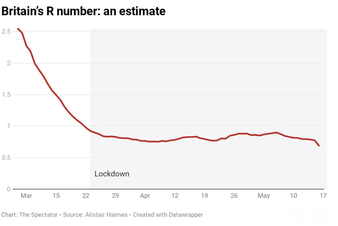
The trickier part is the x-axis, the dates along the bottom to which our data relates: tricky, because this R we have calculated for a particular day will actually relate to infections picked up by the deceased around three weeks beforehand, this being the average length of time between an infection and its related death. Again, this three-week period from infection to death was calculated and published early on, but this three weeks is actually a distribution rather than a fixed number of days, so if we could divine the exact day that victims were infected then it might be that the blue or red lines need to shift a few days earlier or later; but in the round it shouldn’t be far off and wouldn’t change the shape of the curves. But looking at the (red) English line, for example, you will search in vain for any particular change around the date of lockdown (23 March) however much you hunt, simply because the curve is so smooth.
An obvious criticism of this approach (and one I have made myself) is that a disease will tend to knock over the most vulnerable quickly and will tend to encounter more resilient victims as it also runs out of susceptible hosts to infect. So if we are trying to show infections calculated from deaths, the left-hand side of our lines will show numbers a bit higher than they ought to be. How much higher is difficult to say.
Another point to note is that this approach is calculated on national deaths in all settings (including infections picked up in care homes and in hospital: the one thing that really could have made a material difference to the spread of the virus in the UK, as in Sweden, would have been more scrupulous efforts to keep it out of care homes). Although important data, this will not help politicians deciding lockdown policy given that care homes and hospitals are essentially locked down anyway, so other Rs are calculated from other datasets to verify that this data is ‘ballpark’.
The ONS publish weekly results of random Covid blood-tests in the English community (i.e. outside hospitals / care homes), currently showing that 0.1 per cent of us are infected (around a quarter the level required for a disease to be considered ‘epidemic’); R calculated from this dataset has been steady just under 0.8 for the past month or so. I have also been calculating R based on the volume of Covid triage calls to 111 and 999 (by definition these calls will exclude people already in hospital), and again this flavour of R has been a little under 0.8 for the past couple of months, even when restricting the (NHS) data to the over-70s, the more vulnerable (and relevant?) age group. All good news: anything under 1, and the epidemic is dying out.
The shape of the infection curve – for that is what it is, and presented differently would show a bell-curve – is strikingly similar for all three countries (and I could have done exactly the same with Spain, USA, France or Italy etc. – all the same shape). But it looks very different to the lockdown-induced cliff-edge graph based on Imperial modelling. All three countries were at R of 2.5-3.0 early on in the epidemic, peaked before lockdown, declined fast, dropped below 1.0 (signifying the peak of the epidemic) around the third week of March and are currently around 0.8 to 0.9 have bumbled around just under 1.0 for the past couple of months.
This explains the very similar epidemic curves for all countries in Imperial College’s latest report regardless of interventions, and explains why (as Bristol’s Simon Wood points out in an excellent recent paper) you will look in the charts in vain for any convincing evidence that lockdown turned our tide. By tweaking an assumption you can move the peak of my graph forward or back a few days – but you cannot change its general shape. And that general shape, drawn from observed data, poses an utterly different view of Covid than that used as a basis to declare lockdown.
I am not an epidemiologist. The above is offered as a contribution to an overdue debate. It’s my contention that the R graph is easily drawn, and that any evidence-based attempt to do so would show a curve very similar to the one I have produced. For Public Health England to publish such a graph – as health authorities in other European countries have done – would be easy and a valuable contribution to the debate. If what I’m saying is wrong, it should be easy to show another R graph for observed (not modelled) data. But if what I say is right, Prof Ferguson has been giving a version of events that is hard to reconcile with the observed trajectory of the virus.
PS: The sources I use are here for Germany, here for Sweden and here for England.


Comments