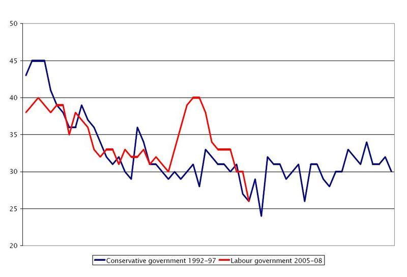
Daniel Finkelstein highlights this fascinating graph over at Comment Central. The red line represents Labour’s opinion poll ratings since 2005; the blue line those of John Major’s government between 1992 and 1997. With the exception of a Labour spike during the “Brown bounce”, the correlation sure is striking:
Peter Hoskin
Are Labour going the way of Major’s Tories?


Comments