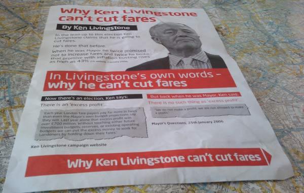
The leaflet pictured above landed on my doorstep in Peckham last week. It’s the most interesting piece of election literature I’ve received this year — not because of its words, but because of its graphic design.
If you read it closely, it appears to be an official communication from the Tories. The legally mandated imprint declares it to be ‘Promoted by Ian Sanderson on behalf of the Conservative Party, both of 30 Millbank, London SW1P 4DP’ — and that would accord with its strongly anti-Ken Livingstone text.

If you don’t examine it closely, however, it appears to be an official communication from Labour. The highlighted details are red, and all the text is set in the Labour party’s favourite font, Neo Sans. In fact, it fits the national Labour style more closely than many leaflets from the Ken campaign: those often employ another sans serif font, Univers.

An inattentive voter, therefore — or even an attentive voter whose eyesight was too weak to decode the dinky imprint — could be forgiven for thinking that it was a leaflet from Labour disowning the Labour candidate.
Political junkies: do you think such design cross-dressing is a legitimate campaign tactic? I’d be interested to hear the arguments for it, and to know whether it’s happened before. (Poster parodies are something different, I think.) For myself, I confess that this approach does more damage to my opinion of those using it than it does to my opinion of their target.


Comments